FacebookコメントをレスポンシブWebデザインに対応する方法
最終更新日時:
2015/02/02 20:17:02
はじめに
Facebookのコメントプラグインの仕様が変更されました。以前はCSSのスタイルでコメントボックスの幅を100%にすることで実装できましたが、アップデートが実行されてからそのスタイルが無視されるようになりました。
The Comments box lets people comment on content on your site using their Facebook profile and shows this activity to their friends in news feed. It also contains built-in moderation tools and special...
 developers.facebook.com
以上の記事内のHTML 5 Attritute のdata-width 属性には、以下のように記述されています。
The width of the plugin. Either a pixel value or the literal 100% for fluid width. The mobile version of the Comments plugin ignores the width parameter, and instead has a fluid width of 100%.
私なりに日本語に訳してみると
プラグインの幅。ピクセル値または流動幅にするために直接100%のいずれか。コメントプラグインのモバイルバージョンでは、幅のパラメーターを無視し、代わりに流動幅の100%になります。
すなわち、HTML 5属性、data-width の値を指定するとOKということになります。
FacebookコメントプラグインをレスポンシブWebデザインに対応するには
コメントプラグインのタグ内に data-width="100%" を追加します。このページのURLはJavaScriptのlocation.href等で取得するとよいでしょう。
<div class="fb-comments" data-href="このページのURL" data-width="100%" data-num-posts="5" data-colorscheme="light"></div>
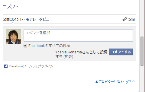
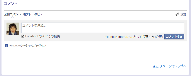
すると、下の図のように横幅いっぱいになりました。
スマートフォンサイズ
デスクトップバージョン
関連記事
INDEX